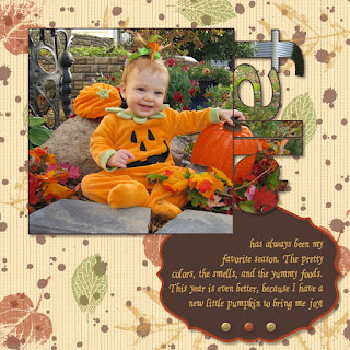
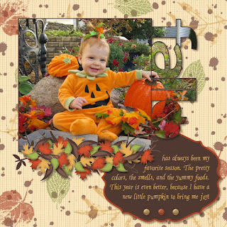
I've gotten many comments on my contest page, so I wanted to be sure to put together a step-by-step instructions for those of you who wanted to recreate the look.
First I started by creating the background paper. For this I used Autumn Spice digital pack- the stripped paper and the french foliage stamps. With all the stamps on this page the program was already slowing up a bit, so I exported the page allowing me to use the background as a single DSP in further steps, making thing much faster.
Next I added my pictures and journaling. In order to get the pictures into the punch shapes (simple letters punch and the pumpkin punch from the Grateful Heart Thanksgiving Ensemble) I started by filling them with DSP. Then, if you click on the punch there is an option in the bottom left hand corner there is a button to "Replace image". Using this you can then navigate to your picture and fill the punch with the picture instead. I also made sure "Rotate image with punch" was unchecked, since I wanted it to stay in the correct direction. Then it was just a matter of zooming out and moving the picture around until I matched it up with the surrounding picture pieces.
The other pieces I used on this page were the glimmer brads and the Lots of Tags Shape 3 punch for the journaling block. The font used is from the Creating Keepsakes website and is called "Ali's Hand". It is pretty much my go to font for all journaling that I want to look handwritten.
After all this was done I exported my page- For future reference I will call this the BASE IMAGE.
For the next step I started with the base image set as the background paper, and then I put the tree image from the Bold Branches stamp brush set on top of it. I also added a white drop shadow to help the branches pop a little. I then exported this page- it will be referred to as TREE IMAGE.
Now, I once again started with the base image as the background paper and I added the two punches as shown above. I then filled the white punch with the tree image and the purple punch with the base image. This allowed me to cut out the branches that I didn't want, and only keep those in the location that I did want, giving this final result:
Once again I then exported the page to be used later as a background.
Next I moved on to creating the leaves. The leaves are from the Autumn Traditions digital kit. I punched out the leaves in the base color I wanted them. Next, I put a slightly smaller version of the punch on top of each leaf and filled with DSP. I then double clicked on it so that I could drag the DSP off the image, allowing me to add a drop shadow to the punch with no actual image in it. This created the lighter center of each leaf. Finally, using the textured stamp (shrunk WAY down) I added the darker shading to the edges of the images. Then, you guessed it, I exported the page which I will refer to as the LEAF IMAGE.
Last but not least, was adding all the little leaves on top of the sticks to make it look like a fall pile. I started with the base image as the background, then added small versions of all four leaf punches. I filled each of these with the picture of the leaf image (zoomed out and centered over each leaf area). I kept a version of each of these four punches along the side of my paper so that I could just make a copy of it and rotate it as needed when I put it on the leaf pile, that way I didn't have to go through the process of punching the leaf every time.
And there you have it. My many hour page! Although I can't spend this much time on all my scrapbooking (or I would get nothing done) I'm glad I was able to do it for this page because I love the finished effect. A perfect page for a perfect picture- which by the way also took an hour to get because the little stinker was so absorbed in looking at all the props around her that I couldn't get her to look at the camera and smile. About the time I was ready to give up we finally got this little jewel :)


