It's been awhile since I've posted, so let me catch you up on my life as of late (and then you'll understand my lack of posts as well...)
Back in February we discovered our family of two was shortly going to become three! Yup- we're expecting a little bundle of joy around Thanksgiving time this year. Thus the baby flutters- my little tike is starting to move and it feels like I'm getting butterfly kisses from inside my belly (very ticklish mind you :) ). In preparation for the baby, I've been frantically trying to finish up the actuarial tests I need to complete to get my first level of certification. I'm getting close now- I have to take a test in August which I am currently studying for, and if I pass it I will have my ASA!!!
Sadly, this has not left me much time for crafting, so thankfully I still have lots of my Christmas album to share with you. I realize it is out of season, but hey, it should still offer ideas for scrapbook layouts and it will get you more acquainted with the possibilities of digital scrapbooking.
Here's my title page:
The background paper with a strip on the side was created with three layers. First, I made the entire background a solid real red. Next, I added a strip of Christmas Cocoa DSP to the left side of the screen. Finally I added the same DSP to the right side of the page, lined up the images where they overlapped, and changed the opacity of this final sheet so that the real red background would show through the white sections. Neat trick!
The other "cool" thing on this page is the Christmas Tree. It is actually a stamped flourish turned upside down! I also used a couple of layers of the stamp in order to achieve the 3D effect and make it stand out.
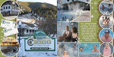
Next on my list of treats for you today is my set of Chico Hot Springs Pages:
 There really are not any "tricks" on these pages, but I just really like the way that they turned out! The tips I would give after finishing this are as follows:
1) Don't be afraid to use the same embellishment multiple times. The only stamps I used on these pages were the snowflakes! However, by varying the size and groupings of the stamps it creates a wonderfully accented and finished look.
2) Shadows, shadows, SHADOWS! The shadow feature is there for a reason- use it often. You may not notice the shadows on the snowflakes, however you would notice the lack of them. Even the shadow itself is not very dark it will help make your pages pop!
Well, hopefully that was a good treat for now. It may be awhile before I'm back again (remember- very large important test in August), but I will return and bring more treats and tricks with me at the time.


