September 25, 2010

A Little Lincoln for Today

I've been working more on my scrapbook of the Washington DC trip. However, as I have gotten bigger it has just gotten to hard to carry my computer with me on the bus each day (it isn't the lightest thing in the world) so the going has been much slower.

Here is a layout that I've finished for our visit to the Lincoln Memorial:


Here are some of the fun things that I did with this page:

Once again I used the Night and Day DSP with the opacity set low so that a background color could be seen through the design. I really love the antique look that this technique gives. Also, you can use one layer of the DSP over multiple "color blocks" of scrapbook paper so that the design flows from one color to the next.

I added the long stamp from Vintage Vogue to the top of my big picture of the Lincoln Memorial in pacific point and also lowered the opacity on this. It gave the picture a softer edge, bringing in the antique theme.

The new dotted scalloped ribbon punch is also a lot of fun, so I added this to both pages to draw them together. I gave them a white shadow- perhaps not the color a real shadow would be, but it really made the outline pop.

Lastly, I have a confession to make. I love the corduroy buttons, but they don't make them in Pacific Point, and I really wanted to add a blue one to the flower in the upper right hand corner. So, I used an outside program (gasp!) to alter the color to a desired shade and then added the embellishment using the "Browse other..." button.

I'm so thankful that SU made it possible to use their downloads in other programs, making changes like this feasible. However, I personally only use other programs to touch-up my pictures and make small changes like this to embellishments. Everything else is SO much EASIER to do right in the My Digital Studio software!

Pin It!

September 14, 2010

Fall is in the Air (2)

As promised, here is my "real" version of my pumpkin card. I'm pretty happy with how it turned out!


I used the oval and circle die-cut for the body of the pumpkin, and edged them in chocolate chip ink. Next, I stamped the leaves and saying from the "Day of Gratitude" stamp set on vanilla cardstock. This set is from the new Holiday Mini Catty- if you haven't checked it out yet you should take a look, there are some great things in there! I punched out the saying with the new decorative label punch and cut out the leaves. The "stem" of the pumpkin was formed from the rounded tab punch, and also serves as the hinge for the card... see how it opens!


The finishing touch was adding a nip of ribbon to stand in for the vine and.... WA-LA we have a nice fall card! Makes me think of pretty fall colors already :)

Pin It!

September 4, 2010

Fall is in the Air

I love the smell of fall. Now, I've been told many times that what I'm smelling is the leaves falling off the tree and starting to decay... but I don't care. Don't ruin it for me- when the air starts to smell of fall it makes me happy!

I'm not sure why I like fall so much. Perhaps it is the pretty colors- the red, oranges, and yellows are everywhere making all the trees and plants look purdy. Then again, perhaps it is the decorations- grapevine wreaths, cornstalks, and pumpkins. Who knows- truth is, for whatever reason, or perhaps many reasons, fall is just my favorite season (even if it does lead into the dreaded winter).

So in honor of fall I created this digital card in MDS, which I hope to soon make a paper version of- once I steal some supplies from my mother :)


Enjoy, and check back later for the "paper" version.

Pin It!

August 27, 2010

Another helping of DC

Here is the next page I've created for my Washington D.C. album.


No real fancy tricks with this one, just a fun layout. I love how big you can make the pictures in MDS.  When I do traditional scrapbooking I find that I rarely use pictures any size other than 4x6... but here I was able to make them the entire width of the page.  It really helps to draw the attention to the "main attraction" of the beautiful water fountains at the WWII Memorial.

Since I don't have any cool tricks today I will at least make up for it by posting another layout.  I find that searching layouts is always helpful anyways... that way you don't always have to reinvent the wheel to create a scrapbook page.  Instead, you just have to find a wheel that will fit.  So, without further ado, here is the Korean War Memorial.


Once again I used a large picture to highlight the memorial pool.  I also added to little tiny round cute pictures as an accent.  I had a lot of fun on this page creating the bunches of flowers... embellishments like that always look better in groupings.

Well, I hope you've enjoyed these fun pages, cause I really like them!  Check back later to see how the rest of our trip went.

Pin It!

August 25, 2010

Free Again!!!

Finally took my exam and I'm FREE again.  Guess what I've been doing in my free time... Yeah, that's right, I've been documenting my Washington DC trip again.


I absolutely love this layout! It was inspired by Heather Summer's page found here.

My trick for today is how I created the background paper. Look really closely... do you recognize the pattern? If you said it looked like one of the "Night and Day" papers from last year you would be correct! But what is this... it's blue!

Here is all you need to do to create this look.  Use a solid color background (pacific point in my case) and then add a black and white patterned paper over the top. Last but not least, turn down the opacity on the patterned paper until the desired look is obtained.

The "Night and Day" paper is perfect for this technique! I have been using it throughout this album and just love the texture it gives, so keep your eyes open for it on the following pages.

Pin It!

July 10, 2010

New MDS Downloads

I just decided to splurge on a whole bunch of new MDS downloads and I'm having a blast with the new selection.  I've even started a new album for my recent trip to Washington D.C. (so no Christmas layouts to share today, YEAH).  Here is my title page:


Don't you just love the way it turned out.  My whole family went on the trip, and this picture is courtesy of my brother- he's such an awesome photographer.  The "new" elements on this page include the vintage vogue and vintage overlay stamp sets, striped ribbon, corduroy buttons, and boho blossoms punch.

Now, for a couple of tricks I used to make this page:
First, I created the background paper myself using many layers on top of a solid color fill.  The bottom layer was the crinkled vintage overlay, stamped in the same color as the color fill but with a darker saturation.  In order to do this, when selecting the stamp color first select the basic color you want, then go to the "HSB" menu.  Click on the circle in front of the "B" and then to the left a sliding scale will appear where you can brighten or darken the color.  Adjust this saturation until you are pleased with the final result and click "OK."  My next background layer was a set of white script.  You don't need a stamp to do this, just make a very large text box and add whatever sayings or poems you desire, and select an elegant looking font.  For my script I decided to stick with white text, but I toned down the opacity to make it blend into the background.  Can anyone figure out what words I used??  The final layer of my background is the sponged vintage overlay- I actually applied this twice in black (once at full opacity and once at half) in order to get the depth of color I desired.

My second trick is how to create a title with a border.  This is actually quite simple to do.  To begin, make the title the final size and fond desired.  Then make a copy and paste it without an offset (this is one of the standard buttons).  Change the color to the outline color and send it back a layer.  Next, using your arrow keys move it up and left once (this will not work if the snap to grid is on).  Repeat the process moving it in all four directions to achieve the full outlined look.

The final trick is one I've mentioned before.  Did you notice all the shadows on my flower bouquet??  I love how they make it pop.  I tend to turn up the opacity on my shadows to 75% (much higher than the standard setting) to achieve this look.  Also, I will often center the shadow on the image so that it has a halo effect like the light is straight up instead of to the side.

I hope you've enjoyed these tips.  If you haven't checked out SUs new digital downloads I highly suggest you take a look at all their new additions.  Some of them are so much fun!  Also, lately they've been adding content every week, so check back often and maybe you're favorite stamp set or accessories will be available soon.

Pin It!

June 30, 2010

Baby Flutters

The title this time is not meant to be a play on words- it is what I'm feeling right now!

It's been awhile since I've posted, so let me catch you up on my life as of late (and then you'll understand my lack of posts as well...)

Back in February we discovered our family of two was shortly going to become three!  Yup- we're expecting a little bundle of joy around Thanksgiving time this year.  Thus the baby flutters- my little tike is starting to move and it feels like I'm getting butterfly kisses from inside my belly (very ticklish mind you :) ).  In preparation for the baby, I've been frantically trying to finish up the actuarial tests I need to complete to get my first level of certification.  I'm getting close now- I have to take a test in August which I am currently studying for, and if I pass it I will have my ASA!!!

Sadly, this has not left me much time for crafting, so thankfully I still have lots of my Christmas album to share with you.  I realize it is out of season, but hey, it should still offer ideas for scrapbook layouts and it will get you more acquainted with the possibilities of digital scrapbooking.

Here's my title page:


The background paper with a strip on the side was created with three layers.  First, I made the entire background a solid real red.  Next, I added a strip of Christmas Cocoa DSP to the left side of the screen. Finally I added the same DSP to the right side of the page, lined up the images where they overlapped, and changed the opacity of this final sheet so that the real red background would show through the white sections.  Neat trick!

The other "cool" thing on this page is the Christmas Tree.  It is actually a stamped flourish turned upside down!  I also used a couple of layers of the stamp in order to achieve the 3D effect and make it stand out.

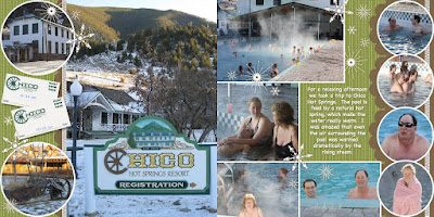
Next on my list of treats for you today is my set of Chico Hot Springs Pages:

There really are not any "tricks" on these pages, but I just really like the way that they turned out!  The tips I would give after finishing this are as follows:
1) Don't be afraid to use the same embellishment multiple times.  The only stamps I used on these pages were the snowflakes!  However, by varying the size and groupings of the stamps it creates a wonderfully accented and finished look.
2) Shadows, shadows, SHADOWS!  The shadow feature is there for a reason- use it often.  You may not notice the shadows on the snowflakes, however you would notice the lack of them.  Even the shadow itself is not very dark it will help make your pages pop!

Well, hopefully that was a good treat for now.  It may be awhile before I'm back again (remember- very large important test in August), but I will return and bring more treats and tricks with me at the time.

Pin It!

April 7, 2010

Wrong Holiday

Wow- It's been awhile since I've had a chance to post.  But between work, study, and life in general my last month has been pretty crazy.  It doesn't help that I haven't been feeling top notch either, and so I've slept a lot which diminishes my free time even more.  But anyway, enough about my boring life and onto the more interesting subject at hand... what have I made lately.

Well, I know that we just had Easter, and so this is completely out of season, but I just finished up my Christmas digital scrapbook and I was excited to share with you.  So, over the next couple of posts I'll show off some of my favorite pages- and perhaps you will be motivated by the layouts or colors to get to work on your own scrapbook.

Here's my favorite spread, from our Christmas tree hunt.  I hope you enjoy it as much as I do:

By the way, the program I used to create these wonderful digital pages is "My Digital Studio" by Stampin Up.  It has been by far my favorite toy for the past couple of months.  If you haven't given it a try yet, I highly suggest that you check it out.  Now, if you are a traditional scrapbooker only, I bet you're thinking "but I don't think I'll like a digital product as much as I like to play with real paper and embellishments," and I admit that I was a skeptic at first as well.  However, ever since I've tried it I've loved the flexibility it brings- I no longer have to guess how big to print my pictures, or how far to zoom in so that I can get the right size.  Now, I have the ability to size my pictures exactly how I like, not to mention if I don't like what the end product looks like I'm not out anything- I can make as many changes as I'd like without ordering new pictures or buying more paper in order to fix it.  I'm actually having a very hard time scrapbooking without it now and wish everything was available in a digital form : )

Pin It!

March 15, 2010

A Different Kind of Flutter

There will be no butterflies today... but we still get to have wings.

Ever since I saw Patty Bennett's milk carton bird house I've been itching to try it.  Evidently I wasn't the only one, because these little cuties have been showing up all over the web.  Well, my first chance at creating one finally came on my "craft weekend."  When my mom asked what she should bring with I fairly begged her to include the milk carton die and bird punch.

Saturday morning I was awake and up before everyone else (which really is a shocker in my family) and so I got to work making my my little abode.


For the house I decided on So Saffron, since it was a nice springy color (hint- cut an 8 1/2 x 11 piece of cardstock in half and you can get two houses out of one piece of paper).  Then, to add texture I covered the die-cut with the "Very Vintage" stamp around wheel.  Next, I punched a hole in one side of the milk carton and then assembled the whole contraption.  Finally, a piece of Soft Suede with a scalloped edge was added for the roof.

Then it was time to create my cute little birdie.  I decided to try to make it look like a bluebird, because in Minnesota they are a sign of spring (and boy am I waiting for that sign this year...)!  By this time my mom was up and about as well, so she helped me to cut out a "belly" shape for my bird, which I then sponged along the lower edge with whisper white craft ink.  After that it was just a matter of adding little details and assembling the whole scene.  I was pretty happy with how it turned out.

While I was busy creating my birdhouse, my mom decided to create her own little project... and I have to admit it is the first dog house I have seen (details at BerryPineStamping).  Didn't they both turn out cute??


Pin It!

March 11, 2010

Easter is Flying In

For my first creative flutter I’m going to share with you an Easter candy dish that I created.

This past weekend my parents were up to visit, which for me usually means craft time with my mom- she’s a SU! Demonstrator and so she always brings lots of fun toys to play with!  Well, this time one of the “toys” that she brought with was a handful of Petal Cards (made with the Big Shot die).  I had remembered seeing a cute little basket made out of this diecut in the catty, and so I set about to make my own little version for Easter.  Here’s what I came up with (and, of course, it involves butterflies):


I started by using the Abundant Hope stamp set to add a cute little greeting to the front of the bowl and the fancy little flourishes to the sides.  I even stamped the main saying inside as a little “surprise” to be revealed as the candy was eaten.  Next, in order to get the sides of my dish to stay upright I added a decorative strip around the bottom made with the cute new scalloped trim punch (ya gotta love Sale-a-bration).

At this point I just felt that there was something missing, but then I recalled a card I had seen with floating butterflies inside and decided that my box needed to be exploding with them.  So, I used some of the Good Neighbor DSP (once again, ya gotta love Sale-a-bration) and cut out lots of little butterflies with the Beautiful Wings sizzlit.  After that all that was left was to attach them to the dish using window sheets and crystal effects.

Stay tuned for another project from my craft weekend and our experiment with… Unmounting Stamps!

Pin It!

March 10, 2010

Take to Flight

Even the smallest flap of of a butterfly's wings can help to shape the future.

Well... my ambitions are not that lofty, but I do hope to help inspire your creativity.  In return I'm hoping you will inspire me.  You see, I have a very busy life between work, study, family, and friends; so I often forget to take some time to relax with my hobbies.  Just knowing that you're out there will motivate me to get back into what I love.

So what are my hobbies you ask?

For starters, I was introduced to rubber-stamping when I was still in school, and I have loved it ever since.  It is amazing how you can put so much of your own style into something such as a card, and make the recipient feel special and loved.

My next love was scrapbooking.  I started this hobby just before it became really main stream- and I remember how in that first year I was scrapbooking the selection of materials in craft stores nearly tripled.  It was an amazing time to become involved in the hobby, literally witnessing its birth.  Recently I have shifted my focus from traditional scrapping to digital.  In fact, since the holidays "My Digital Studio" (the digital papercrafting program made by Stampin Up) has become my favorite toy.  I love how I can take it with me on the bus, making my time spent commuting much more useful.  I'm sure I'll be sharing many of my samples here in the days to come.

My other hobbies worthy of noting are those of the textile variety.  I taught myself to crochet and knit in college, and I also have quilted on occasion.  However, as you well know, these sorts of hobbies take MUCH longer to complete, and therefore will only show up spradically.

Final Flutter

My favorite symbol has always been that of the butterfly.  It represents a new phase in life, and therefore this small creature has always held a special significance for me.  I have used butterflies to usher me through every turning point in my life- confirmation, graduation... the flowergirl at my wedding was even decorated with a pair of monarch wings.

And besides, butterflies are just plain beautiful creatures.  So, don't be surprised if they appear often around here!

Pin It!